On Wednesday I was appalled to see news of another mass shooting in Florida. Once again, the world is watching in dismay as the US struggles to address the underlying issues.
As I’ve learnt more about the US system of government in recent years, I’ve come to admire its ability to recognise problems and make changes. But all change requires persuasion – That’s true, whether you’re pursuing the noble mission of fixing an injustice in society, or whether you’re just trying to change the way your company works.
When we’re convinced of the need to change something, it can come as a shock to discover that others don’t agree. Even when we provide statistical evidence, robust models, and detailed plans, our proposals often fall on deaf ears. Perhaps people’s ears aren’t the best way into their hearts and minds. We might be more persuasive if we were to convey our message in different ways – engaging emotions as well as intellects, and using pictures as well as words.
Florence Nightingale understood this in 1858, when she put infographics at the heart of her argument for better hospital hygiene in the publication “Notes On Matters Affecting The Health, Efficiency, And Hospital Administration Of The British Army.” I might have suggested a pithier title (e.g. “What’s Killing Our Soldiers?”) but it’s hard to find fault with her use of images to enable her audience to absorb the meaning of her longitudinal analysis in a single glance.
With the rise of social media, which allows people to share infographics very easily, the value of these images has increased. Inevitably, most infographics are variations on some common themes; lots of bar charts and pie charts. Occasionally, a designer breaks the mould with some innovative and creative data visualisation that holds my attention for a long time. Today, I was pleased to find this kind of creativity applied to the issue of mass shootings in the US – The New York Times produced a subtle but stunning image in its short editorial about the inertia of US lawmakers. The graphic is a calendar that shows every day since the Sandy Hook massacre in 2012, with a colour code to indicate days when lawmakers passed modest gun control legislation that’s widely supported by their constituents.
Not a single day is coloured.
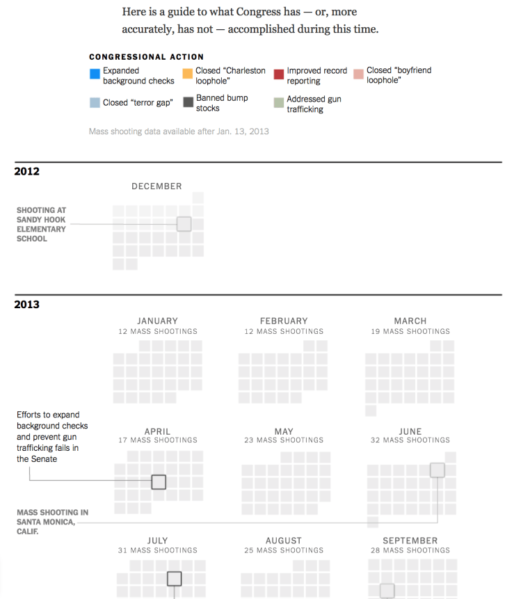
I’m sure this “breaks the rules,” of data visualisation in a fundamental way. There must be some principle that infographics work best when unnecessary visual elements such as icons and colour codes, are eliminated. This graphic offers a shocking indictment of Congress by tearing up that rule and presenting a monotonous, grey, grid that makes a mockery of the colour code; a grid punctuated only by text that describes the constantly repeated pattern of mass shootings that take place every month and debates that go nowhere. I’m impressed.
Will this infographic break the stalemate in Congress? Of course not. But it will play a role, along with letter writing, demonstrating, and other activism. The same is true when we want to drive change within an organisation. It’s not realistic to expect people to be persuaded by a single message in a tired-old, format that they’ve seen before. As customer experience professionals, we have to find creative ways to help our colleagues to empathise with customers, to see ways to improve the way our organisation works, and to be receptive to change. What creative approaches do you use to communicate with your organisation? What media and formats are the most effective when it comes to persuading colleagues of the need for change?
